Launching campaign for Bohosh
Brand Strategy • Creative Direction • Packaging Design • Campaign
Brand Strategy • Creative Direction • Packaging Design • Campaign
The body wash category is highly saturated, dominated by clinical white packaging and heavy typography. BOHOSH needed to command immediate shelf presence on competitive retail shelves and online.
Prove to the consumer that an accessible $12 product can deliver the exact same aesthetic and sensory value as a $30 boutique luxury alternative.
Target’s primary female shopper (ages 25–44) and a growing Gen Z segment who actively seek "cheap chic"—high-design aesthetics and clean, expert-backed ingredients at accessible price points.
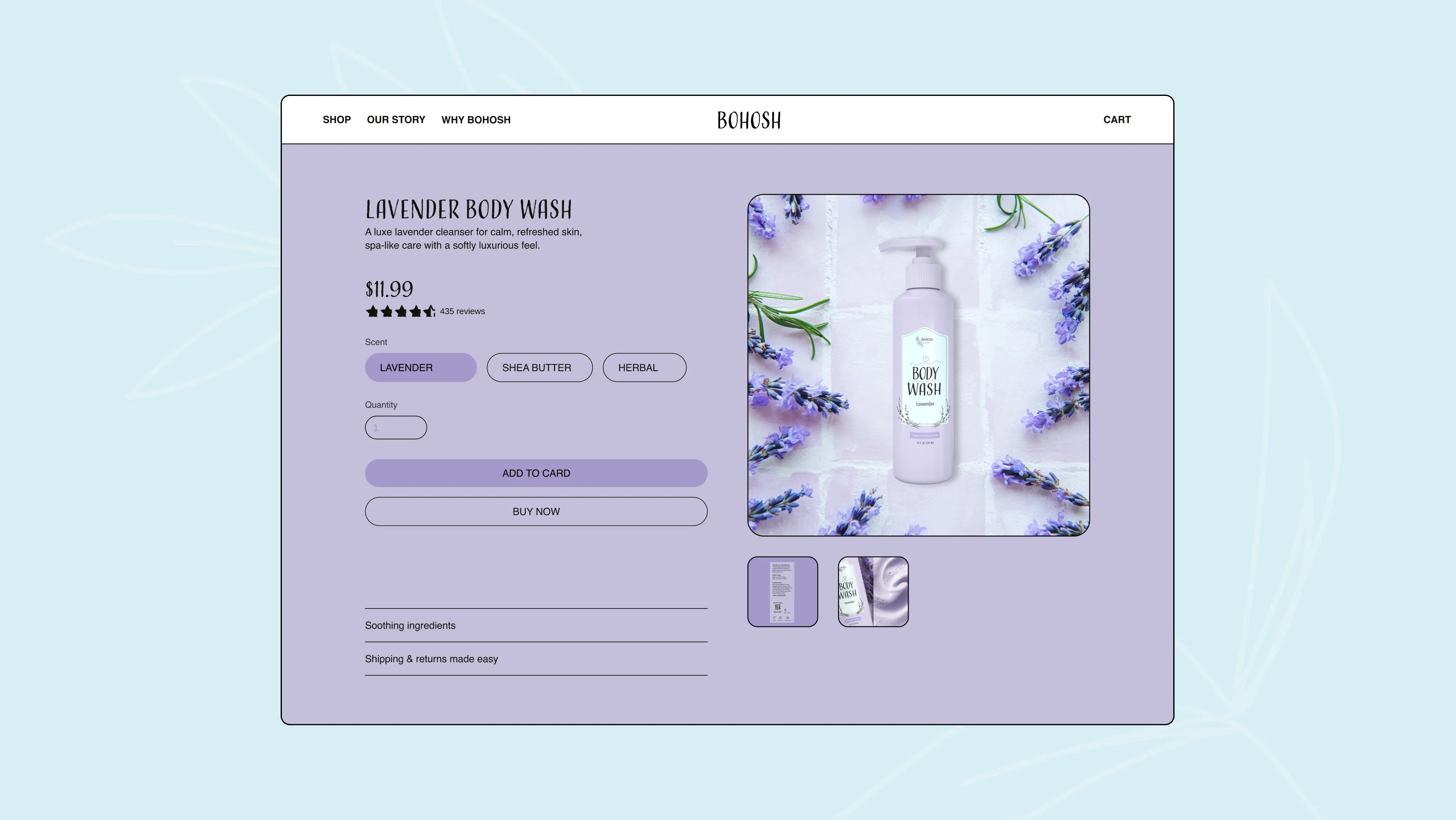
Over 20% of sales occur via digital apps (Drive Up, Shipt, and Target Circle). The visual asset system must be optimized to stop the scroll and communicate luxury at miniature thumbnail sizes.
While competitors rely on cold, clinical, hyper-minimal layouts, BOHOSH carves out a new space: Accessible Everyday Luxury.
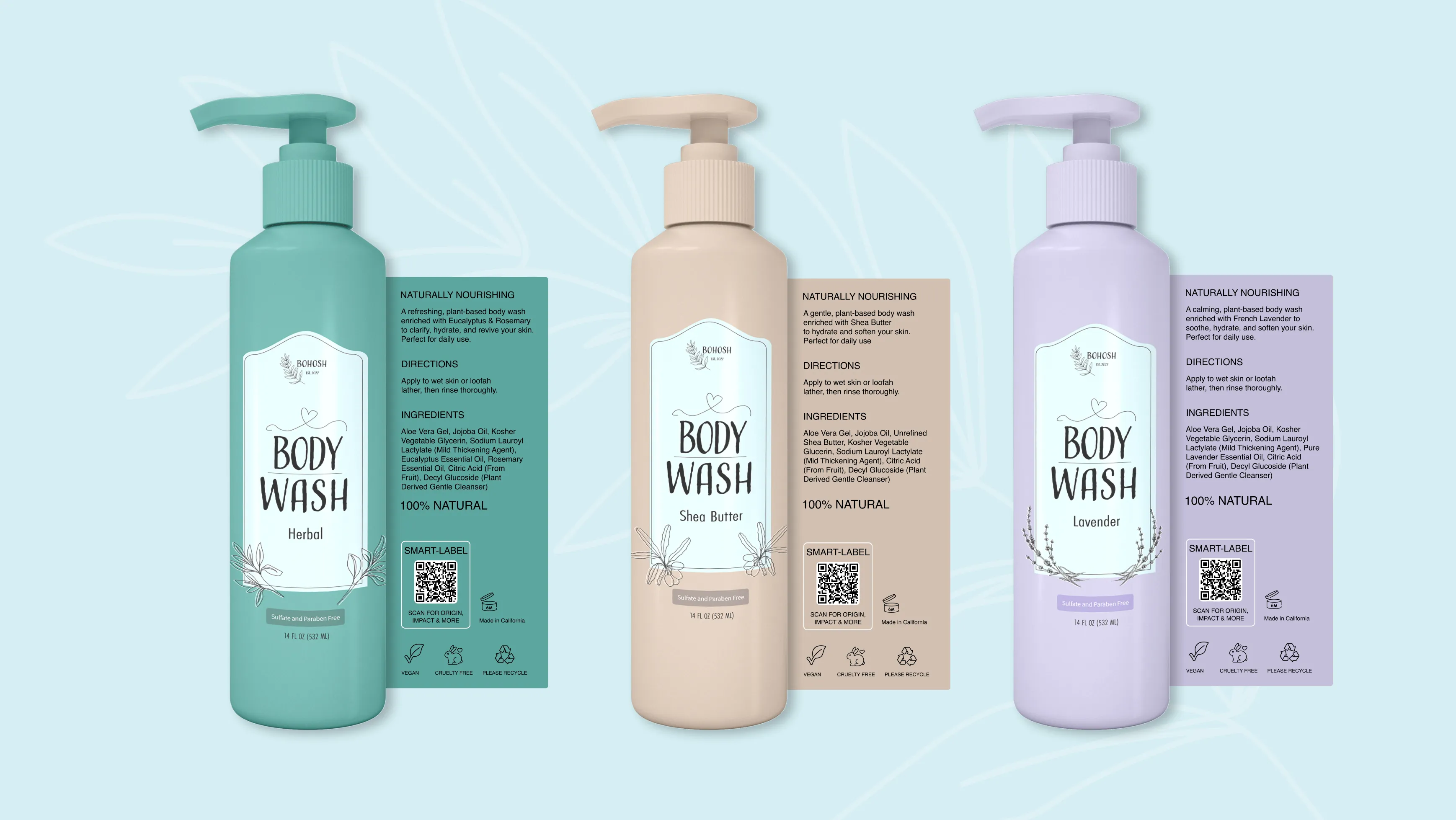
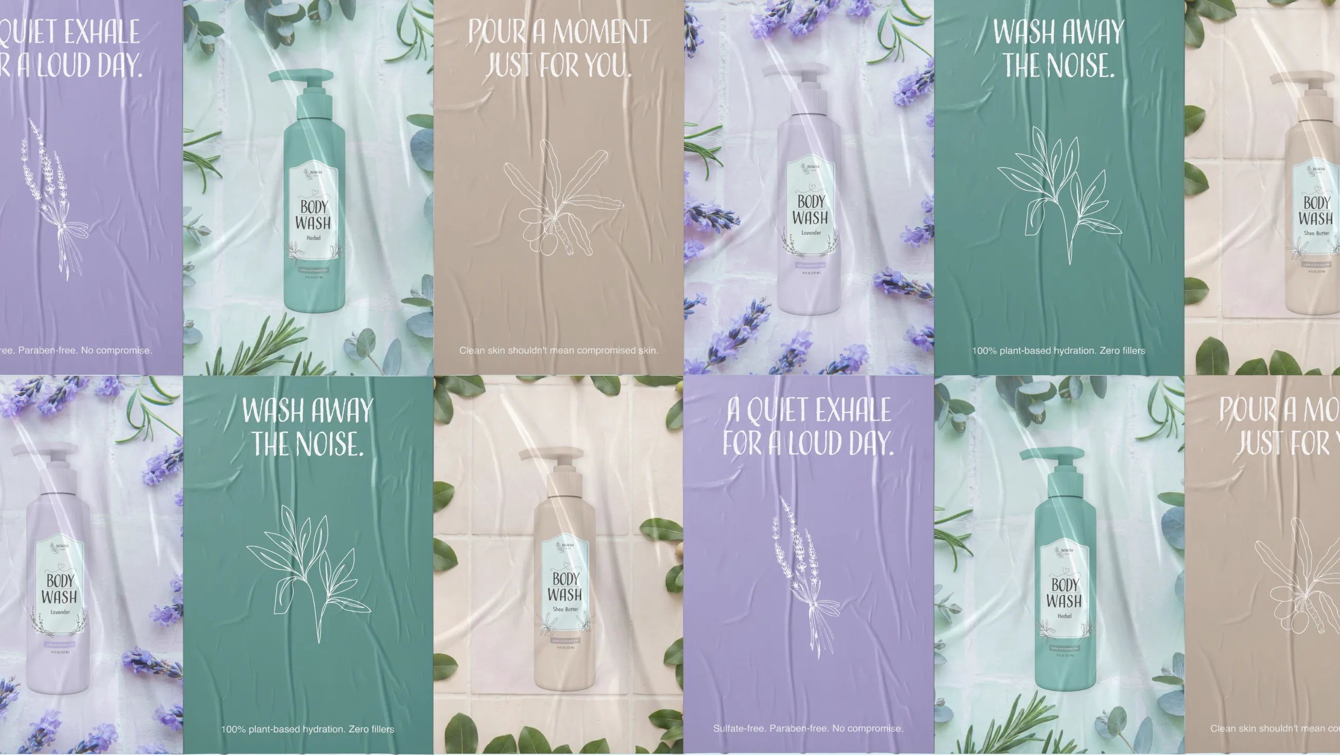
An intentional, color-coded packaging system designed to disrupt the retail monotony and turn a routine daily shower into an atmospheric sanctuary of calm.

Whimsical & Structured. The layout creates visual contrast by framing custom, hand-drawn botanical illustrations and expressive typography within a clean, geometrically balanced frame. It delivers a relaxing daily ritual while maintaining complete ingredient transparency.
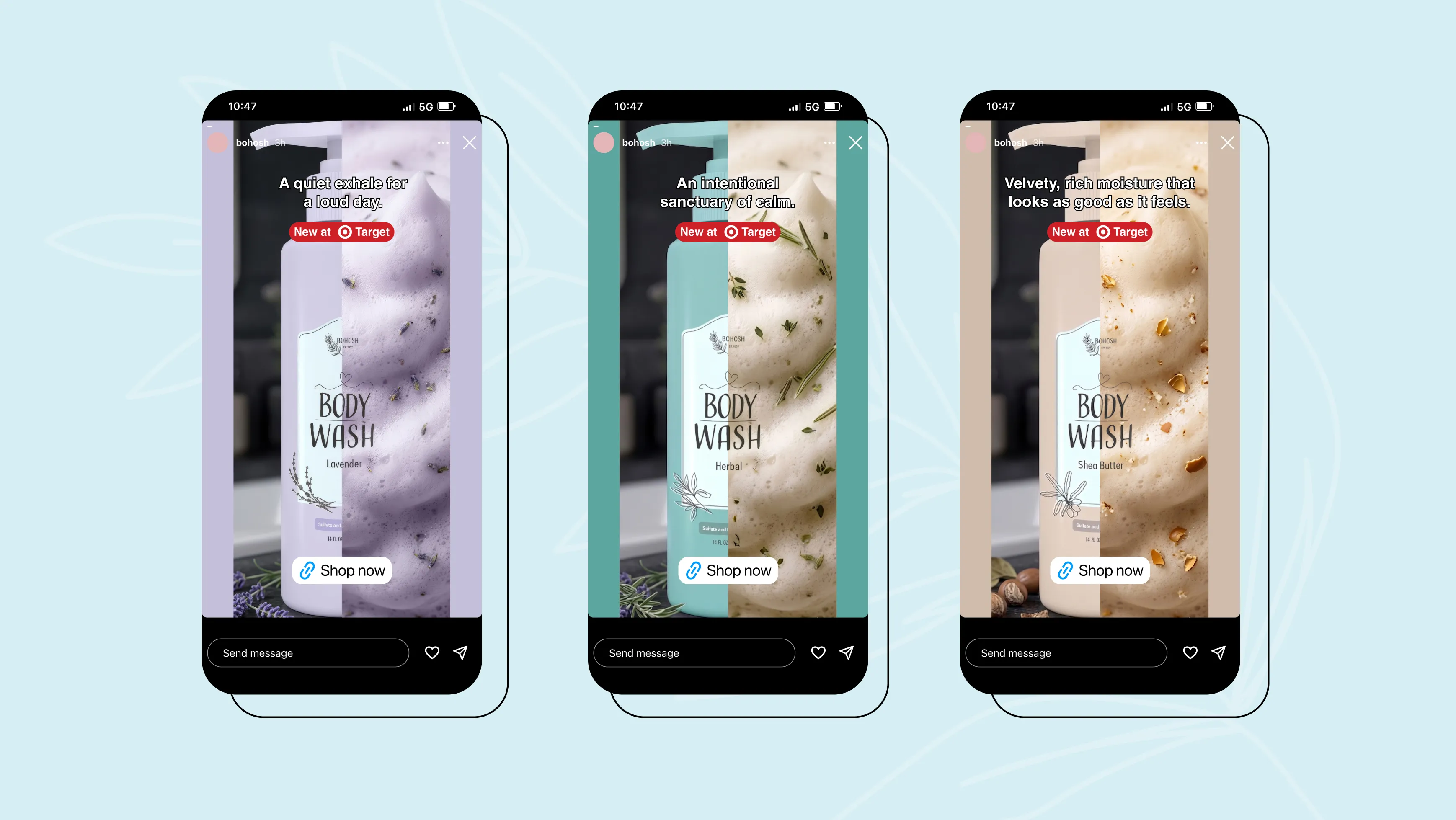
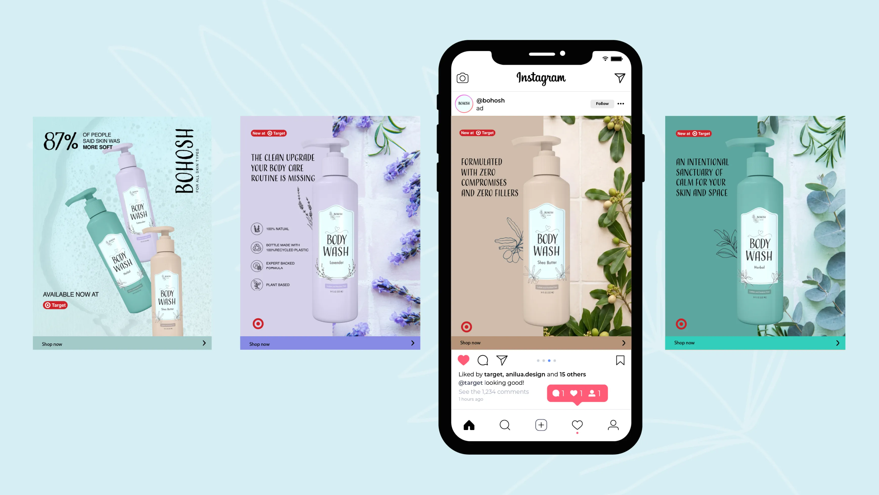
Custom graphics for social media ads
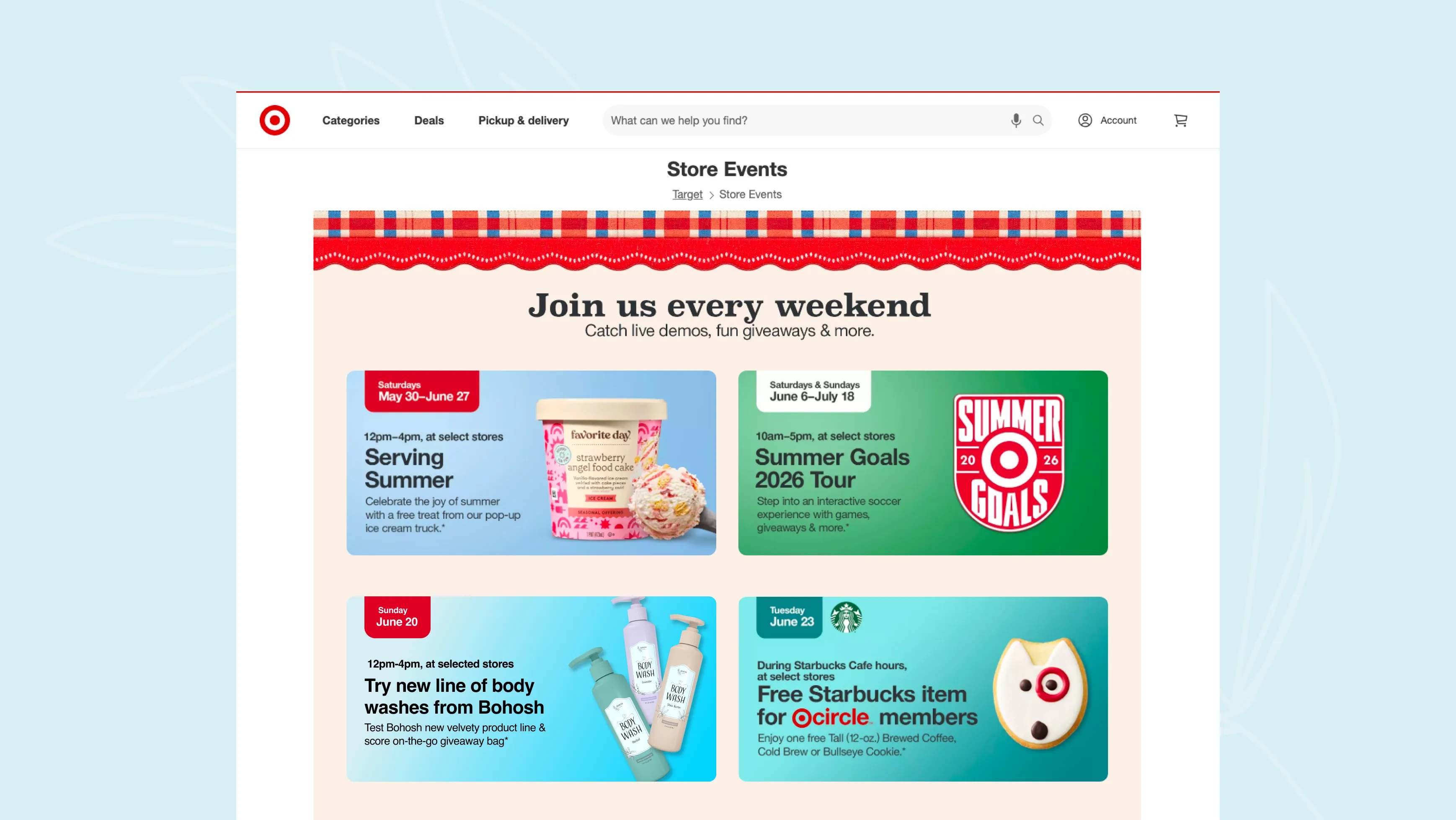
To support the launch of Bohosh's new product line, I proposed an in-store Target demo event designed to increase brand awareness, educate shoppers, and drive product trial and sales through live demonstrations.
Disclaimer: This is a self-directed conceptual case study created solely for educational and portfolio demonstration purposes. Bohosh is a fictional brand concept and is not officially affiliated with, endorsed by, or partnered with Target Brands, Inc.
![[digital project] image of interface explaining ai curriculum](https://cdn.prod.website-files.com/6a5fb055fc65c674ce4a0937/6a62e684d2a40672c87c3b61_Bohosh%20Hero.webp)